
I trained some new Tensorflow machine learning models on images of the Boston Massacre. Because of the way things worked int he moment, when the Boston Massacre drawing was create it was also recreated in different ways to spread the word, and used as propaganda by different publications. Copyright wasn’t a things, so multiple variations exist out there, and I chose my favorite three base upon the colors and textures that was present.
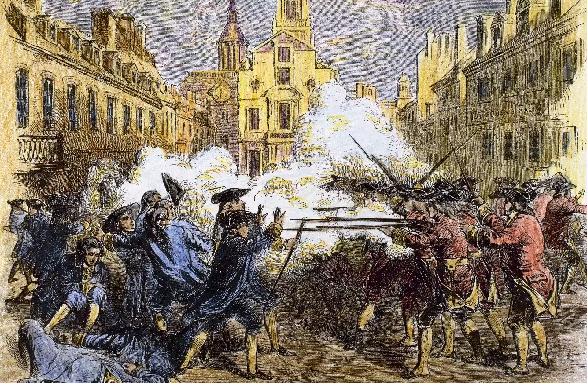
I like the darkness of the first one. I like the sky and the shadows. I like the distinct blue and red. Same hats on both sides, but distinct colors. The hands up on the American side tell an important story, with smoke obfuscating the background.I feel this one is rougher, dirtier, but the shadows are so intentional and interesting for what I am looking for.

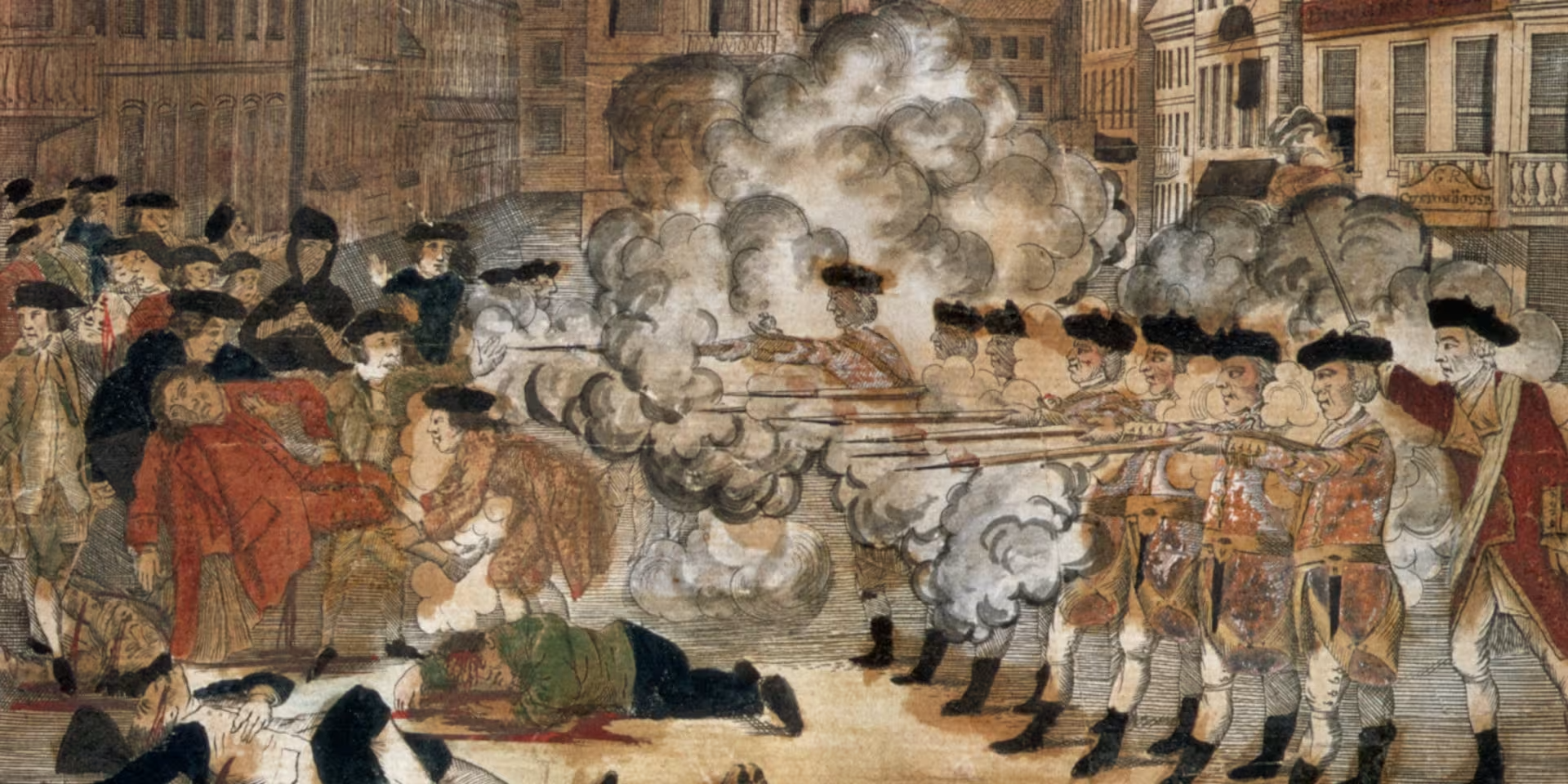
The second one feels almost religious. The color is much messier on this one. The clouds of smoke have the dirty edges and is mostly engulfing the British side of the square. This one feels like it could be from the Middle Ages for me for some reason. The blood is interesting flowing on the ground from the Americam’s heads. The hats are less detailed too.

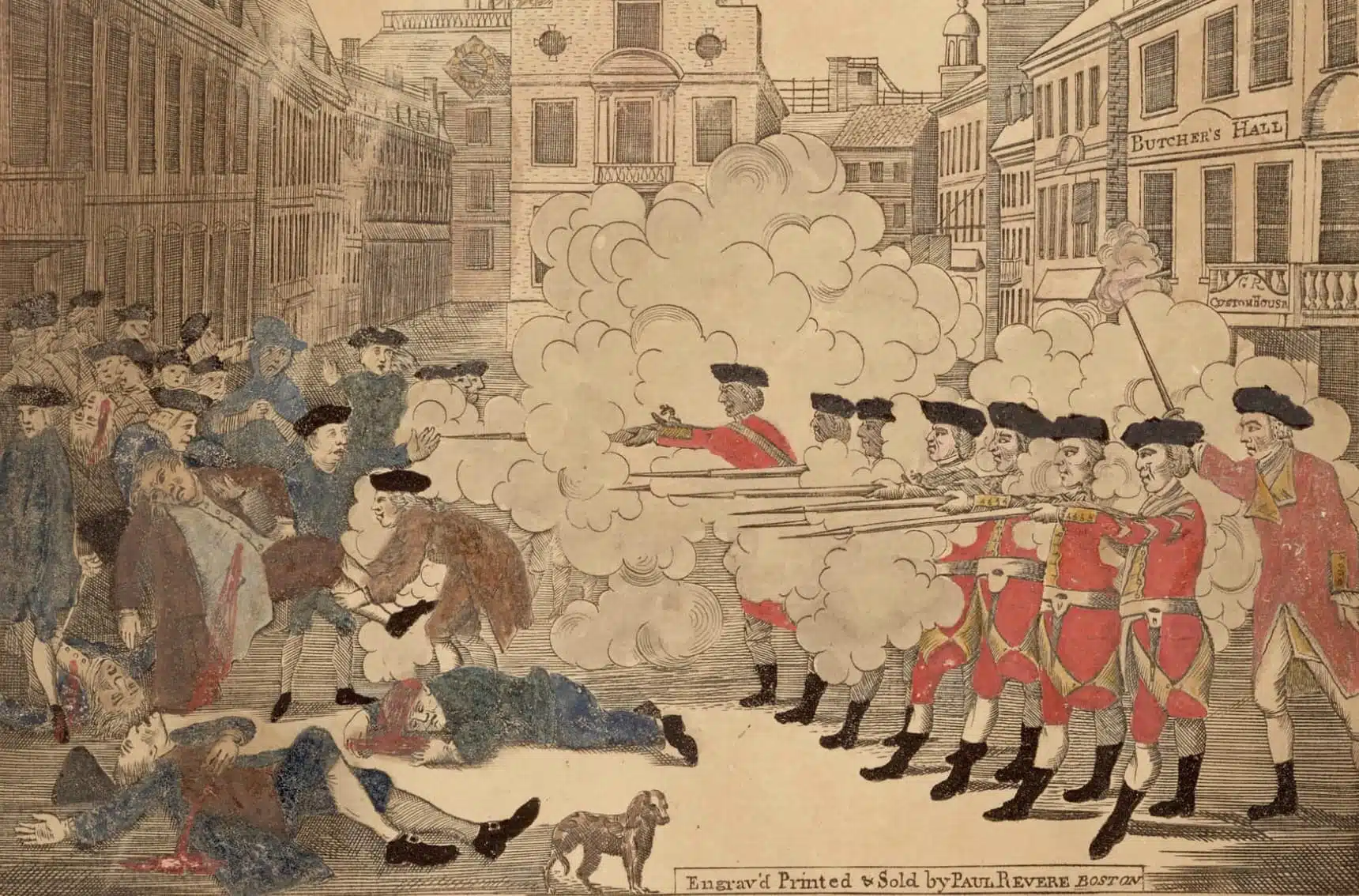
The third one feels almost commercial. It feels like a brand or something. The clouds are so drawn. The bleeding Americans are more pronounced. The dog in the foreground is instresting. I also really love this one is engraved and printed and sold by Paul Revere of Boston, which I think provides even more backdrop for the type of drawing that it is.

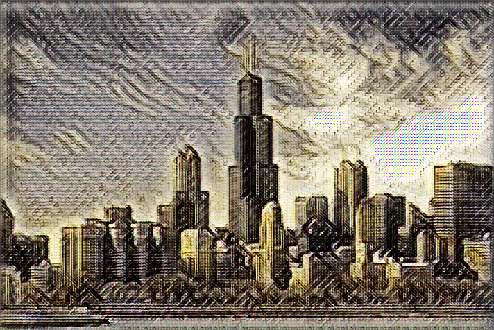
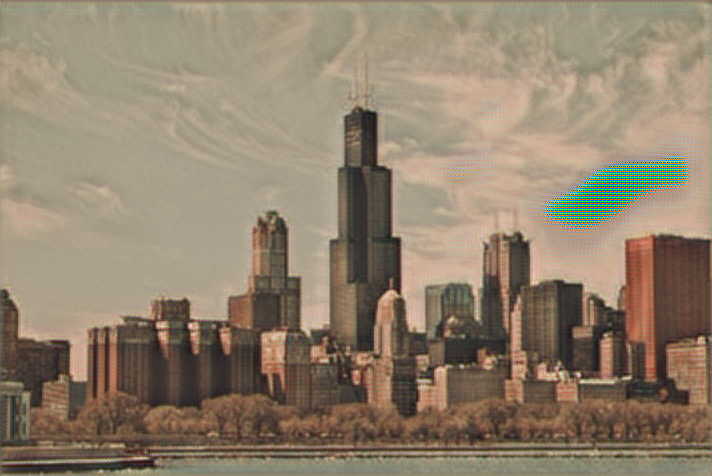
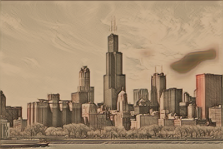
I train a Tensorflow machine learning model on each of these three images for about 48 hours using an Amazon Web Services GPU server. It costs be probably about $200 to make this, and when it runs, it always produces a test image using a picture I have from Chicago—I believe it came with the university project where I forked the original algorotoscope work.
I really like the roughness of this first one and know by experience that it will do interesting things with clouds. I can’t wait to see what is possible when it is applied across my photo gallery.

The second one is definitely smoother and milkier. I like how it’s out of focus. The thin spots are more visible.
Tis one is dreamier. It has harder edges. It’s washed out. I like what it does to the edges. This one is not as far away.

Tis one is dreamier. It has harder edges. It’s washed out. I like what it does to the edges. This one is not as far away.
I will run against my different sets of photos. See what it does. It takes a while to get familiar with how each model applies itself. I’d say my favorites right now are in the order as they appear. I like the rougher one the best. This is something that will definitely shift over time. As I learn more about each model’s characteristics.

I will run against my different sets of photos. See what it does. It takes a while to get familiar with how each model applies itself. I’d say my favorites right now are in the order as they appear. I like the rougher one the best. This is something that will definitely shift over time. As I learn more about each model’s characteristics.
I most like how very little of the color comes through. I think I will be able to add color using water colors or colored pencils. We’ll see what adds the color back in the wy that makes sense. All of them have the edges I am looking for in this moment. I like the idea that there are multiple copies because of different agendas. It works well with my stealing from images using Tensorflow, and then reappropriating for my own purposes, apply the essence to the photos I take.
